Mobile Devices and Rails: Maintaining your Sanity
CommentsThe “mobile web” may look more like the web we know and love as devices get more powerful, but there will always be a place for a bit of customization in the name of improved UX on mobile browsers. CSS media queries go a long way toward accomplishing this, but you may find yourself wanting to do more. Ask around or do some searches, and you’ll find the usual answer to supporting mobile devices in Rails involves adding a MIME alias for text/html named “iphone” or “mobile” with register_alias, then forcing a mobile request’s format to this MIME for use with respond_to. This can work, but it’s a huge pain in the neck, and I believe there’s a better way. Read on.
Q. Why buck the trend?
A. I am lazy.
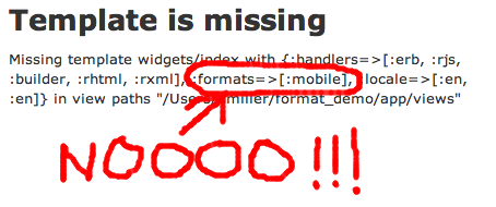
Let me explain: If you specify a custom format for a request, your app needs a corresponding template for every single action a mobile browser might access, or you’ll get a fun error message like this:

There’s no way I’m gonna create two files for each action, even when they’re identical. My ideal solution should use a mobile template if it’s available, but fall back to a sensible default if not. Convention over configuration, right? Right.
So, let’s tackle this in two main steps. First, let’s set up our mobile app at m.mydomain.com. Requests made to the “m” subdomain will use our mobile templates, if they exist. Once we have that working, we’ll handle user agent detection and allow toggling between the mobile and full version of our app (because sites that don’t allow you to get at the full version even when your device is capable of rendering it are downright rude).
View Paths
When Rails sets out to render one of our templates it looks for them in our controller’s array of view paths. Normally, this is going to contain app/views. View paths work much like the $PATH environment variable in your shell. If you type a command into your shell, your system goes through the directories listed in your $PATH, in order, and runs the first executable of the given name that it finds. Similarly, if Rails wants to render the action for widgets/index, it goes through your view paths in order, looking for a suitable candidate. If it finds app/views/widgets/index.html.erb, it will stop looking and render this file.
This means that if we prepend app/mobile_views to the array of view paths, we can place our custom mobile view for our widget index into app/mobile_views/widgets/index.html.erb. When Rails finds this file, it won’t bother looking in app/views for our default template. However, if we don’t bother creating an app/mobile_views/widgets/show.html.erb file, we can fall back to using the one in app/views. Laziness satisfied!
Prepending our Mobile View Path
Let’s get started. In our ApplicationController, we just need to add a few lines:
app/controllers/application_controller.rb:
      before_filter :prepend_view_path_if_mobile

      private

      def prepend_view_path_if_mobile
        if mobile_request?
          prepend_view_path Rails.root + 'app' + 'mobile_views'
        end
      end

      def mobile_request?
        request.subdomains.first == 'm'
      end
      helper_method :mobile_request?
At this point, we can connect to m.mydomain.com (assuming our server is properly configured – I’d suggest ghosting m.[yourhostname].local if you’re testing locally on OS X) and our app will render from app/mobile_views before falling back to the standard app/views.
If you’re OK with telling people to access another URL for the mobile version of your site, I guess you could stop here. It’s that easy. But it’s not much harder to handle toggling back and forth, so let’s do that, too.
Device Autodetection and Site Preferences
We’ll need to add some methods and a couple more before_filters to our ApplicationController, for starters – here’s what the full file will look like:
app/controllers/application_controller.rb:
    class ApplicationController < ActionController::Base
      protect_from_forgery

      before_filter :set_mobile_preferences
      before_filter :redirect_to_mobile_if_applicable
      before_filter :prepend_view_path_if_mobile

      private

      def set_mobile_preferences
        if params[:mobile_site]
          cookies.delete(:prefer_full_site)
        elsif params[:full_site]
          cookies.permanent[:prefer_full_site] = 1
          redirect_to_full_site if mobile_request?
        end
      end

      def prepend_view_path_if_mobile
        if mobile_request?
          prepend_view_path Rails.root + 'app' + 'mobile_views'
        end
      end

      def redirect_to_full_site
        redirect_to request.protocol + request.host_with_port.gsub(/^m\./, '') +
                    request.request_uri and return
      end

      def redirect_to_mobile_if_applicable
        unless mobile_request? || cookies[:prefer_full_site] || !mobile_browser?
          redirect_to request.protocol + "m." + request.host_with_port.gsub(/^www\./, '') +
                      request.request_uri and return
        end
      end

      def mobile_request?
        request.subdomains.first == 'm'
      end
      helper_method :mobile_request?

      def mobile_browser?
        request.env["HTTP_USER_AGENT"] && request.env["HTTP_USER_AGENT"][/(iPhone|iPod|iPad|Android)/]
      end
      helper_method :mobile_browser?
    end
There’s nothing too complex going on here. We’re going to check if a user has specifically requested the mobile or full site in set_mobile_preferences, and if the user’s asked for the full site, we’ll store a “permanent” cookie that says so – this way the next time they visit our application from this device, they’ll immediately be in their preferred viewing format, because the next filter, redirect_to_mobile_if_applicable, only redirects if the request isn’t already being made to m.mydomain.com, the user hasn’t previously stored a cookie that says they’d like the full site, and the user agent appears to be a browser we’d like to redirect to the mobile site. You may want to season your mobile_browser? method to taste. The one I used here works well for my needs.
The only thing that remains is to place a link allowing the mobile user to toggle between sites. I put mine in the footer of my application layouts. For the mobile page, it’s a simple link_to.
app/mobile_views/layouts/application.html.erb:
<%= link_to "View full site", url_for(:full_site => 1) %>
On the full page, we only want to display the link “back” to the mobile site if the user is on a mobile browser:
app/views/layouts/application.html.erb:
<%= link_to "View mobile site", url_for(:mobile_site => 1) if mobile_browser? %>
That’s it!
comments powered by Disqus